Showing posts with label Color Mark. Show all posts

Friday, July 26, 2013

Butterfly Friday

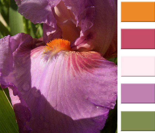
The other day I was walking back to the office with my camera in tow and saw a bunch of bright yellow butterflies fluttering around me. Just around the corner from the office I was able to catch one of them sitting on top of a beautiful lavender flower.

Color match Pantone: DS 289-1 C, DS 300-3 C, 
DS 309-4 C, DS 183-1 C, DS 189-9 C

I though this palette was perfect to bring back an old favorite of mine, the Color Mark section. I love how bring and cheerful these colors are, and how they can adapt to any summer design. 

Have an inspiring weekend!

Tuesday, January 15, 2013

Color Mark: Cupcake Hues

I always admire photographers that specialize in food styling and photography. Many times I give it a try but rarely get that delicious treat looking just as good as it tastes.

Pantone color matches top to bottom: DS 323-6 C, 
DS 171-8 C, DS 219-9 C, DS 12-4 C, DS 138-7 C

I took a pictures of this delicious cupcake while on a trip to LA. I love the way it looks, the textures and colors that make you want to take it and indulge in the creaminess of the frosting. These colors can be used in walls and decorations as you can mix and match them to create a calming environment.

Have a delicious day!

Thursday, October 18, 2012

Color Mark: Casco Viejo's Hues

To round up my week about my trip to Panama, I thought it was more that appropriate to inspire all of you with some of the beautiful colors I found there.

Colors to match Pantone from top to bottom: 
DS 207-3 C, DS 284-6 C, DS 58-7 C, DS 82-7 C

I love the softness of the colors but they are still vibrant when put together. They also have a sense of the Tropics that is not too in your face, but still makes you think of vacations and the blue shade of the ocean.

Have a sunny day!

Wednesday, September 26, 2012

Color Mark: Tangerine Orange

Today´s Color Mark is different, because my computer is at the hospital and there´s no Photoshop to get it done. But, it was scheduled on my calendar, so I decided to go ahead with shades of orange or tangerine.

Image Credit 1 and 2

This color has all the energy of red paired with the happiness of yellow, to become a vibrant and joyous color. It is associated with the sun, the tropics and in a dual way, it is associated with many shades that the fall season comes with.


In design this color is popular, becuase it is less agressive that red and it is widely used in food promotion, because it stimulates brain activity and appetite.

Image Credit 1 and 2

And just in case you didn't know, orange is the color of the 2nd chakra, which is the one of the abdomen and the creative center{good tip for desk accessories}.

Have a lovely and colorful day!

Wednesday, September 12, 2012

Color Mark: Pepper Hues

Ii'm not a fan of peppers and always had an aversion for their taste and smell. But, I do love their colors that range from deep reds and reds to all shades of green. I find it amazing the colors that you can find at the fruit and veggies section of the super market, it's all about arranging the produce by colors, types and sizes.

Pantone Color Matches from left to right: 378 C, 440 C, 7404 C, DS 76-1 C, 426 C


I took this photo , as you can tell, when I went to Eataly with my sister last year. I was attracted by the color layering of the peppers with other veggies like the eggplants on the back. I don't know if I see these colors on an interior environment... Actually I see them used in some type of promotional advertising or even a fashion collection.

Have a colorful day!

Thursday, August 30, 2012

Color Mark: City Scape Hues

This week I've been particularly nostalgic about my life back in the US for many reasons. For some reason this week I've been on the phone a lot with many of my friends back there... and it reminded me of the good times.

Pantone match from top to bottom: 493 C, 1797 C, 123 C, Cool Grey 2C, 659 C

I took this photo from my balcony... I've always liked this sequence of colorful buildings that are so Miami from back in the 80's before the all white towers took over. The buildings are not architecturally beautiful but they always sort of looked good against he beautiful blue of the sky.

Have a great and colorful day!

Wednesday, August 15, 2012

Color Mark: Cool Summer Hues

I can't believe the Color Mark Section has been on the back burner for over a month now... but today it is back! The summer in one part of the world is starting will start to fade away soon and the winter months in another part of the world will start to warm up.

Colors to match Pantone: Warm Grey 11 C, 7535 C, 9163 C, 624 C, 561 C

I thought this image was the perfect marriage of that summer trend with cooler shades and hues. the Aqua color of the dress with the ivory accents changes completely from a summer outfit to a transitional piece surrounded by cooler colors and illumination. I took this photo on one of my trips to NY while walking back to my hotel late at night.

Have a great summer or winter day!

Wednesday, May 30, 2012

Color Mark: Nougat Hues

On busy weeks like this one I'm always looking for some sweets to help me relax and bring a smile to my face. This image I took it at a bakery in LA ans have always loved the rich neutral colors I got from the goodies being sold there.

Color palettes match Sherwin Williams paints: Ibis White 7000, Unusual Grey 7059, 
Ambitious Amber 6366, Copper Mountain 6356, French Roast 6069

This week I'm leaving to NY and cannot be happier because I'm going to see some friends I haven't seen in a while including Dawn from The Alternative Wife and Brandi from Not Your Average Ordinary... Very excited!

Have a sweet day!

Wednesday, May 16, 2012

Color Mark: Textile Hues

I took this photo in January when I was in LA and went to see the "Pacific Design" exhibit at LACMA. Everything here was designed between 1935 and 1965 which was the time when California design became highly influential in mainstream America.

The paint samples match the following Benjamin Moore paint colors: 
2011-10, 2111-50, 2022-30, 2120-40, 2042-30

These outfits were designed to be used during the hot summer months in California and in them you can see the influence of the Latin culture present in the cities' daily life. I love the deep contrast of vibrant hues against neutral shades.

Have a great and bright day!

Wednesday, April 25, 2012

Color Mark: Bookshelves

Hope everyone's having a great week and daydreaming like there's not tomorrow. On my side I'm kind of winding down after a few friends visit this past week... it's been quite busy over here. Now, I'm looking forward to some down time and reading my a book.

The paint sample match the following colors from Benjamin Moore 
from left to right: 2001-20, 2068-30, OC-108, 2040-50, 2030-30

I took this image at Anthropology while looking at some gifts and the colors and patterns of this notebooks called my attention. I love that the colors in this image reflect all the summer color trends I get to see everyday when I read at all your blogs and online magazines.

Have a great day and please come back tomorrow for an amazing interview!

Wednesday, April 11, 2012

Color Mark: Hydrangea Blues

A couple of years ago, on a trip to Costa Rica, I took this photo when I went to visit a national park famous for it's inactive volcano and turquoise water lagoon. I have always had a fascination for this flower and how much it can change from one place to the other as it adapts itself to new environments.

Paints matches from Benjamin Moore from top to bottom: 
2146-10, 2062-70, 2067-50, R-9981, 2061-10

Blues and greens like these ones refresh any environment as they make people feel surrounded by nature and the ocean. Rooms that receive a lot of sun during the day benefit from the use light shades of blue {like the second one} with accents of green and even yellow.

Have a lovely and refreshing day!

Wednesday, March 28, 2012

Color Mark: Blue Leaf Hues

There is a certain elegance that comes with traditional draperies and tassels that makes me think of sitting down for high tea in a beautiful dress feeling like a lady eating delicious scones with clotted cream. I took this photo at a quaint small boutique hotel in DC during a visit to my sister last year. The image reminds me of opening your windows to let the Spring sun come in and warm up everything.

All colors in this palette match Sherwin Williams paints {from left to right}: Bosporus SW6503, Tranquil Aqua SW7611, Faraway Blue SW7133, Crewel Tan SW011, Renwick Golden Oak SW 2824.

Colors like these can be used in sun rooms where the warm sun light accentuates the golden tones and the blue shades refresh the environment.

Have a beautiful and colorful day!

Monday, March 19, 2012

Color Mark: Lily Hues

Spring has fully arrived even here. My trip to NY last week proved it to me because not just the weather was incredible with blue skies, sunshine and cool crisp air but also flowers and trees were blooming all over the places.

Colors from top to bottom by Sherwin Williams: Navel SW 6887, Heartfelt SW 6886, 
Anemone SW 6567, Drama Violet SW 6978, Rural Green SW 6418

Today's palette makes me want to run out and but all those candy colored pants and tops hanging in every store, fill my house with every single bouquet I can find at the flower section of the super market, and buy a juicer to take advantage of all the brightly colored fruits at the super market.

Happy Monday and go get yourself some flowers!

Tuesday, February 28, 2012

Color Mark: Peony Hues

Today, I start a whole new series at Punctuation Mark called Color Mark. In these series I will be exploring colors in a whole new way because I will be matching them to actual color paints from Benjamin Moore or Sherwin Williams. The idea behind these color studies is to find colors that people can use on their everyday lives.

Paints to match Benjamin Moore: 2086-10, 2003-40, 2171-70, 2166-50, 2169-30

To inaugurate the series I wanted to use the a beautiful peony I took in LA during the Spring of 2010. I love the soft colors and how they go from vibrant pinks to ivory and peach. The softer and lighter tones like the one in the middle can be used a a general paint in a girl's room and the others are accents on wall bases or frames.

Have a great and colorful day!