Showing posts with label Design Punctuation. Show all posts

Wednesday, February 5, 2014

In with the New

There's a new project in store for me, and this one is dear to my heart because it is the place I call home when I go to Miami. The apartment belongs to friends who are so dear to me that they have become family.


Over the next few months we will be remodeling this great apartment by installing new floors, painting, adding new furniture, window treatments, a new bathroom and a new kitchen.


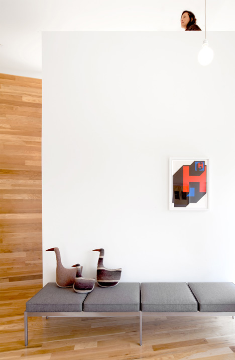
As you can see the apartment looks very washed out with all white surfaces and black and steel furniture with the orange chair as an attempt at color. It is the quintessential bachelor pad... ha!


As I move forward with this project I will be showing you what we do and how we do it, I will share product information, tips and other helpful information for you to get your own renovations going.


It will be a great journey as we give this apartment a new life step by step, and turn it from a house into a beautiful home!

Have a great day!

Tuesday, January 7, 2014

Design Baby

Whenever you hear designers say that projects are like children, well... they are! As you well know I completely dropped off the face of the earth at the end of last year because I was so busy with my design project. The project was finally completed and here are some images for you to see.


The project is a restaurant at the Westin and a beach club for the owners of the residential units of the resort. It included a casual restaurant, a pool terrace, a formal restaurant and a bar lounge.


All the furniture was made locally in teak wood and all the fabric used was outdoor, this way it would be durable and easy to clean.


Because I was dealing with a large open space and needed to create the different spaces somehow. I created the spaces using colored cushions and accent furniture to differentiate each area.


So, here is my latest baby and what it looks like... Hope you like it!

Have a lovely day!

Tuesday, October 1, 2013

Greek Beauty

Few civilizations have had a lasting impact like the Ancient Greeks. Their religion was adopted by the Romans and Egyptians, their constructive styles were copied by allies and enemies across the region, and their art has endured for thousands of years.


Greeks perfected and developed the column as their styles are replicated in major buildings and monuments around the world. Unfortunately, most of what remains of ancient Greece's architecture is in ruins as they built stone buildings with wooden roofs.

 Image Credit

The Greek temple has been regarded as the highest point of excellence and the place for excellence to house their gods. The three major orders or styles of columns that surrounded these edification are Doric, Ionic, and Corinthian {their names come from the place where they were created}.


Pottery was the media where the ancients recorded their lives as all vessels show scenes of daily life, battles, agriculture, celebrations, etc.


I'm sure for many of you one of the best things we've taken from them is their fashion sense. The Greeks created their outfits by draping fabric around their bodies in specific ways and depending on the style you could tell who they were and what class they belonged to.

Have a lovely day!

Tuesday, September 17, 2013

Hieroglyphs and Pyramids

One of the very first civilizations that contributed to our world of art were the Egyptians. They created some of the most spectacular works of art from the pyramids to the sacred tombs to magnificent jewelry.


Egypt developed along the Nile river as it was its main source of supplies and communication with other regions. Along its Delta many cities developed and flourished in art. scince and religion.


Their culture was deeply linked to their religion and the many gods theiy worshiped. Also, they had a strong belief in life after death which made them pay special attention to the way they burried they kings. Expeditions into Egypt have found everyday artifacts inside king's tombs that include models of their homes, wigs, jewelry and even food inside beautifully decorated vessels.


No doubt the best representation of their culture are their hieroglyphs and decorations on the walls that tell the stroy of what they believed in and they way they lived. Through them we've been able to know thier codes of law, what to expect in the after life, the social order, and the mastery of their design skills. Have you ever been there? I haven't but certainly I would love to see everhitng in person one day!

Have a lovely day!


Tuesday, August 13, 2013

Before Design

Little is known of the way prehistoric humans lived beyond what has been found in sites around the world. The most influential designs we have today are objects like pottery, woven baskets, rugs made from animal skin, and the like. You call prehistoric art to those pieces created by civilizations or cultures that didn't have an alphabetic system for record-keeping.


When I studied prehistoric art in school, I was fascinated by the Venus Figurines because they share a similar style even though they were made during thousands of years in different locations. Some of these figurines date as far as 35,000 years, and even though there is no clear significance to them it is believed that they represented fertility, abundance and the mother goddess.


Pre-Columbian tribes in Central and South America created beautiful artifacts that they copied from their  surroundings into decorative objects or as housewares. Other cultures like the Mayas created writing systems that were lost as their civilization disappeared, but luckily left amazing works of art behind.


There are examples of prehistoric art all over the world that you can enjoy. Look for details that depict daily life activities like hunting scenes or meaningful elements like the eagle, which represented the most important god for the Aztecs. There are tons of inspiring art that people who lived thousands of year ago left us... Let's explore it!

Have a lovely day!

Tuesday, August 6, 2013

Designing History

Over the past few months we have explored the basic concepts and elements of design. We have moved from one to the other as they evolve line a dot into a line and later into a shaped or volume. But none of this is new because they have been around for hundreds of years.


Design and art have evolved from primitive drawings on walls to marvels of the ancient world into the iconic structures that we know today.


All designers are part of history by either recreating it and being inspired by the past or by creating new styles and trends that leave a mark.


Let's time travel through the periods that shaped the design world have influenced our clothes, our homes and everything else we enjoy today. Let's enjoy those times when things were intricately decorated or simply austere. Let's go on a trip and discover what passed to see what's coming next!

Have a great day and hope you time travel with me next Tuesday!

Tuesday, July 30, 2013

Design as a Business

I have been a designer for more a while now {time flies when you have fun!} and each and every time a project comes along I'm amazed about the intricacies of this business. Being in an arts related field is not easy as putting a price tag on your creative time is difficult.


As fun as being a designer is long hours and hard work are require to see projects get done. My philosophy is always to find the common ground between me and the parties involved in a project, because we all have our own agenda... the owner wants pretty and inexpensive, the contractor wants to be done ASAP, the designer wants a nice project to add to the portfolio, etc.


 We all tackle a design project at some point in our lives no matter if you are a designer or not. Keep in mind and never lose track of your goal, it might change direction but it should remain constant with a few improvements.


Avoid falling in love with ideas, instead keep an open mind of the possibilities as there might be a more appealing solution for you than what you originally thought of. Pride has destroyed many projects and has driven them to financial debacle.


Finally, make sure you learn something from the process... Today's lesson can translate into tomorrow's success.

Have a lovely day!

Monday, July 22, 2013

Golden Concept

As we start to wrap up the many concepts that encompass the design process, there is a very very important one that deserve a post all of its own. It is the Golden Section or Ratio.
 

The golden ratio is a mathematical constant that represents the relationship or ratio of one quantity and another one which is given a value of 1.6180339887. This ratio is found in everything and anything in nature like the nautilus shells, the buds of new ferns and even our own bodies.


As humans evolved and studied the surrounding nature, they found these relationships that could replicate in everything they designed from buildings to artifacts.


Many theorists, mathematicians, architects and artists {look for Fibonacci, Da Vinci, Euclid, Parthenon architecture, etc.} have talked about the importance of this concept in design. It is usually referred as the perfect proportion between two measurements in order to achieve perfect balance.


Once you learn how to set an photograph, image or any other design from the golden ratio perspective you'll find it everywhere and find how useful it is {all images were taken by me on trips to inspiring cities}.

Have a lovely day!

P.S. If you like this post... tweet about it by clicking on the button below and don't forget to mention  @ElieFournier #design punctuation... Thanks!

Monday, July 15, 2013

Variety and Contrast

They say variety is the spice of life and it certainly is in the case of design as well as contrast. I'm sure you are thinking right now on how many ways you create or design contrast in everything you do every day.


Variety is the design concept that breaks the monotony of others like proportion and harmony by introducing elements that create interest. When applying these concept you apply into a design colors, shapes and textures that catch your attention.


Contrast is used to enhance or decrease the value of a design element like lines and shapes, or the value of other concepts like proportion. By using contrast colors may look lighter of darker, shapes seem smaller of bigger and placer look farther or closer.


Use These two concepts to make simple spaces more interesting, to increase the visibility of a graphic design, or to create focal points out similar objects.

Have a lovely day and hope to be able to see you more often this week!

Monday, July 8, 2013

It's all Proportional

One of the most important things designers learn with time is to have a sense of proportion. This is one of those principles of design that with time becomes sort of a second nature to you and I might even say some becomes experts at manipulating it.


It refers to the relative size and scale of the various elements in a design. It's a matter of the relationship between the elements of a design composition. It is important to have a sense of proportion because all elements are connected, they should be proportionally related to one another and to the whole.


For example, in the project I'm working on right now I have to install a large chandelier and four around it. The size of the smaller ones have to be proportional to the big one and the big one has to be proportional to the space so it doesn't look overwhelming or too small that it dissapears in the space.


Every single part of our bodies is proportional to the other... our fingers to our hands, then to our arms and then to the whole body. Most designs are done in proportion to our body, the kitchen cabinets are proportionally dimensioned and so is the dining table and the height of the chairs... check it out by yourself and marvel at it!

Have a great Monday!

Tuesday, July 2, 2013

Scaling Concepts

It's been a while since we spoke about design over here due to some crazy work schedules. Well, today we're re-taking our conversation and talk about those concepts that help us organize lines and forms. The first of those concepts are size and scale.


Size can be absolute or relative. It is absolute when you compare a cake next to a cupcake in which one is noticeably bigger than the other. In the case of relative is when you compare two large things that one seems to be larger than the other because of the arrangement of its components or its configuration in a space as a whole... it's more a matter of perception.


Scale is the relative size of an object in proportion to other objects and human beings. Scaling is extremely important because it is the concept that makes things look like they belong together by either balancing them or by creating contrasts. For example, large spaces benefit from objects that complement their large scale and make them look grandiose and complete.


The trick is to learn how to use these concepts to create the right impact on people when they enter a room, see an add for a product on the street or how to upholster a chair with a patterned fabric so it looks good. Next week we'll combine today's concepts with another called proportion... see you then!

Have a nice one!

Wednesday, June 5, 2013

Not Just a Lamp

The project I'm consulting for at the Westin Resort has been fun but not without challenges. As part of my design series, I'd like to talk today about the importance of weather in design and the huge impact it has on projects.


You see, tropical weather I believe is one of the most difficult types you can work with, especially if you're by the sea. Humidity, salt water, rays of the sun, lush vegetation and wildlife determine the types of materials and style you have to go for.


As an example, I have to talk about these lamps I've looked for days {many days!} as they have to meet many aesthetic and functional requirements. The things to consider have been: height to bring light to the space at night, volume but not mass as they cannot obstruct the view of the ocean, resort looking to go with the existing decor and resist the changes from dry weather during summer into damp during the winter.


I haven't found THE lamps yet but have a few choices that fill the requirements, but it goes without saying that it has been a great reminder that you have to experience an environment in different times of the year... especially if your project is open to the outdoors. Our weather has a great influence on what we design if its' cloudy or sunny, rainy or dry, desert or forest, beach or city location it certainly makes a big difference.

Have an enlightening day!

Monday, May 6, 2013

Flat Shapes

All shapes start with a dot that extends into a line and end up forming a shape. We use two dimensional shapes on everything like fabric prints, paintings, and even when we set up the table for a party.


Circular and round shapes give the impression to be constantly in motion, they are perfect as the have no beginning and no end, and the are the sign of eternity. They are perfect to be used in places where you want to create motion or a festive environment, they remind you of the sun when used with warm colors or the moon when used with cool ones, and they are playful in children's rooms.


Square shapes are elegant, stable and balanced. These shapes are great to be used in seating arrangements as square tables are easier to fit in a space, square shapes buildings look more solid as they are firmly grounded and they are the foundation for the suits worn by men.


Triangles are the divine shapes as they have been used throughout to define the trinity in Christianity or the burial place by the Egyptians when they built the pyramids. Triangles are directional and remind us of the way tree branches grow.
 
Have a lovely Monday

Monday, April 29, 2013

Lines

The point is the beginning of everything and most certainly the beginning of all lines. The second element of design is the line in all its forms, because depending on its direction and shape it can create different effects. Learn the language of lines to create a greater impact on people or spaces.


Vertical stripes makes things look taller and elongated, gives the impression of reaching out to the sky, upward direction, and tend to have a regal and elegant feel. Use vertical stripes when you want to make low ceiling spaces look higher or when you dress use clothes that give you a vertical quality to look taller.


Horizontal lines open up spaces, remind us of the horizon, give width to objects and give a sense of ease and relaxation. Use horizontal lines or objects in small spaces to make them look bigger and wear horizontal stripes to look wider {or avoid them!}.


Diagonal, oblique or multi-directional lines are dynamic, have a sense of instability, and promote movement. Use these types of lines to break the monotony of a room with chevron floors, add excitement to a room with a modern painting, or impress someone with a patterned outfit.

Have a creative day!